Balance in visual design refers to the distribution of visual weight of elements in a composition. In more simpler terms, if all the objects in a piece of artwork were put on their own scale, how would their weights compare to one another? That’s the concern of visual balance. In my experience, balance is easy to spot, but difficult to qualify. This is because you can look at the balance between any number of objects in a design or as the overall composition.
To understand the different types of balance, we need to look at what affects an element’s visual weight. Besides the obvious (size), these factors include shape, color, value, among other traits. For the word count’s sake, we’ll only look at the first three as an example.
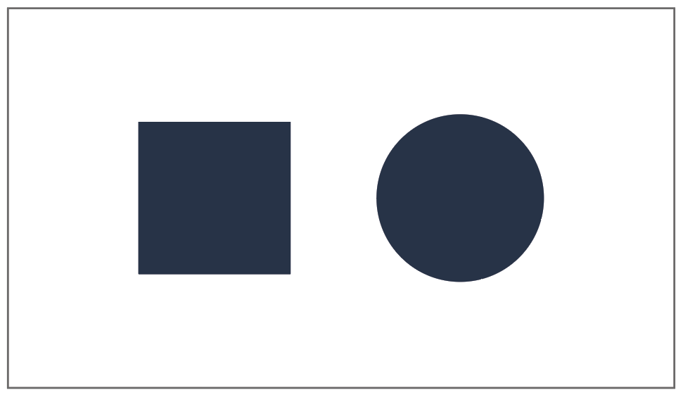
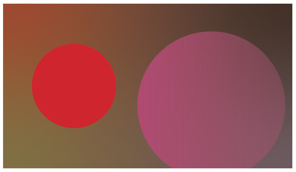
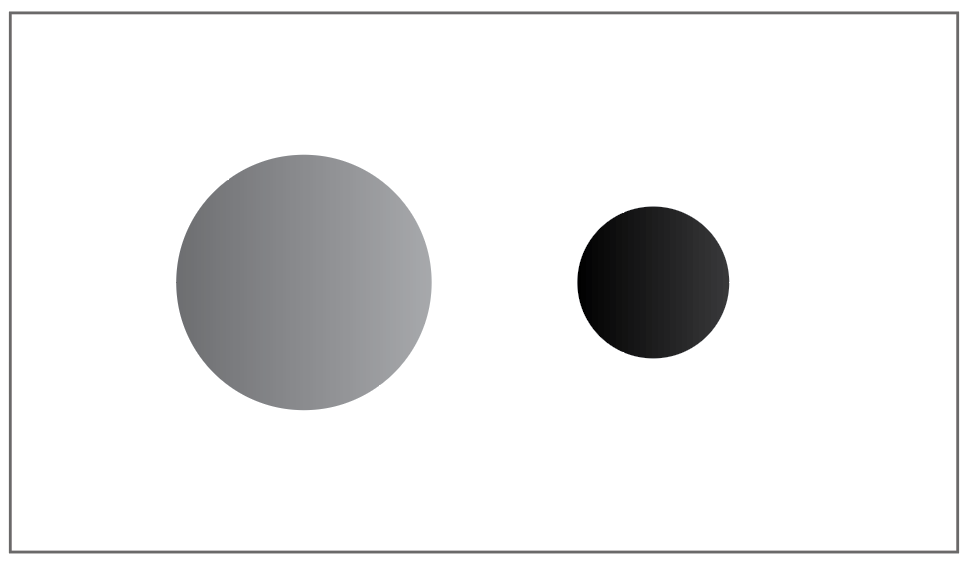
Okay! Now that we know how balance works, let’s talk about three different ways that it can be created. These are the three most significant types of balance in visual design:
Formal Balance (Symmetrical)

This is the type that I bet you’re most familiar with when I say either “balance” or “symmetry”. Formal balance means that a composition uses symmetry to achieve balance in its design. To boil this down, a piece that uses this method likely has elements mirrored across an axis. In the example above, there’s a clear symmetry between the left and right side of the composition. In formal balance, you’re MUCH less likely to change the way things look across a composition, lest you risk disturbing the visual weight of these elements. What that means is that formal balance is much more restricting than other methods, as there has to remain a consistency across an axis.
Formal balance is seen everywhere in every discipline of design. Architects use it for creating easy-to-navigate floor plans, hardware engineers implement symmetry in designing smartphones, and photographers use symmetry to balance their compositions just like graphic designers. Symmetry is visually pleasing in almost any context and is much easier to achieve than other methods, which is why its so prevalent in design.
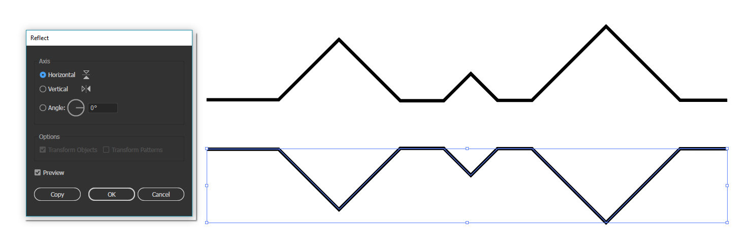
Creating symmetry in Adobe Illustrator is as easy as using the ‘reflect’ tool:
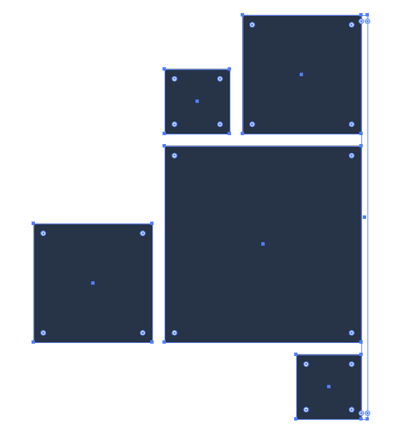
1. Select the object you want to create a reflected clone of. Make sure one of the objects side is either flat, or will look decent being flipped around. In this case, I made the right side flat.
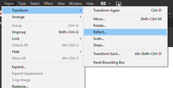
2. Navigate to the Object -> Transform -> Reflect option.
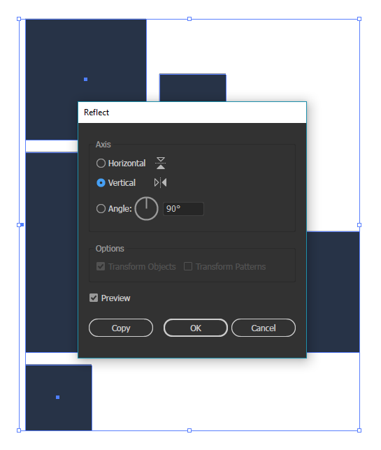
3. Depending on your preferred look, you may want to choose otherwise, but in this case, I used a vertical reflection. Illustrator also allows you to reflect horizontally, or at a custom angle. After you’ve decided, click on “Copy”.
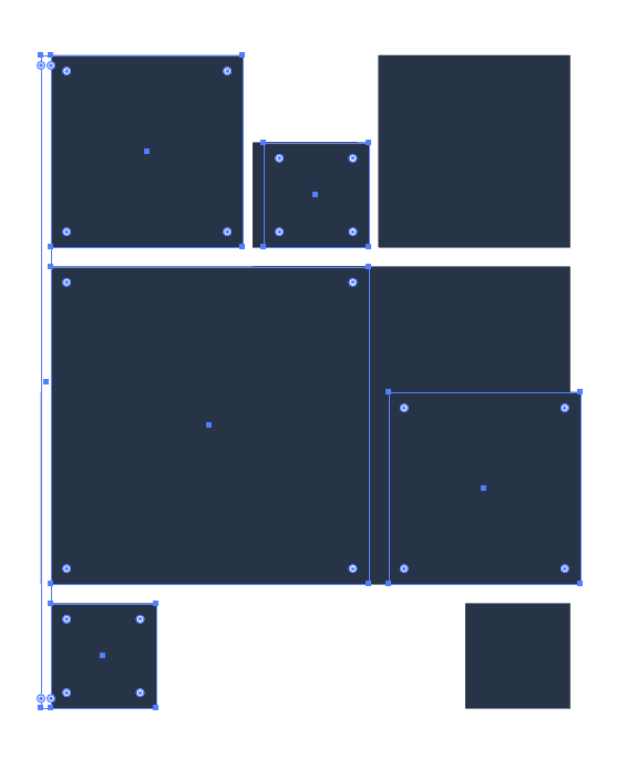
4. This will reflect the object and make a copy over the current iteration of it.
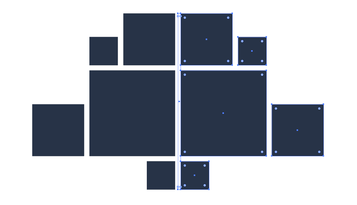
5. Move the newly created object into place, and you have yourself a symmetrically balanced composition.
Even though formal balance constrains what you can do with objects in a piece, there are practically infinite possibilities.
Informal Balance (Asymmetrical)

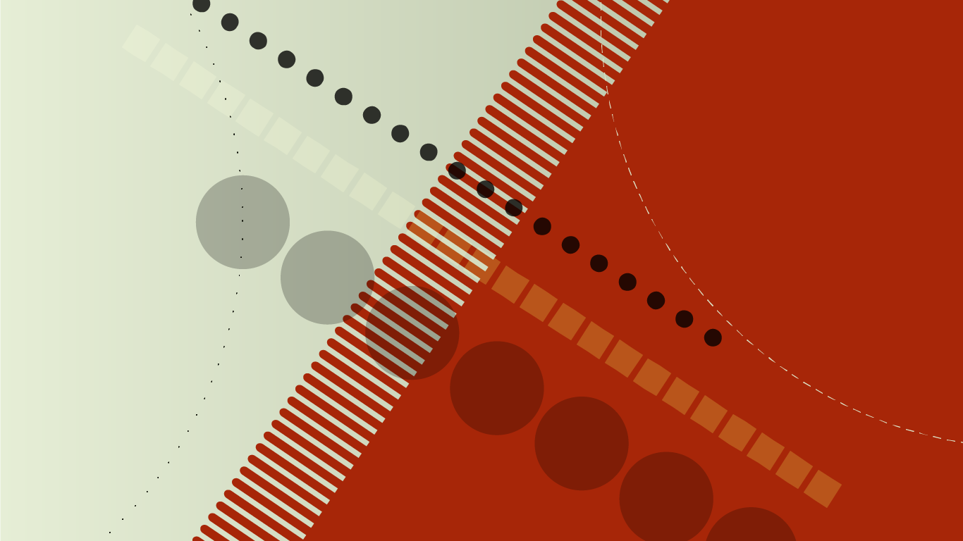
Informal balance seeks to bend the rules of design by creating a composition that isn’t symmetrical, but rather manipulates the visual weight of objects to create balance. Where symmetry is a simple matter of cloning objects across an axis, informal balance requires much more precision to fine-tune these elements’ visual weights. The ultimate goal is not to create balance between two individual elements in a design, but rather establish balance in the design as a whole.
In the example above, there’s a clear visual weight created on the left side of the piece. This is made by the more complicated geometry, more intense colors and generally darker values shown. To compensate for this, there’s a noticeable light gray negative space on the other side of the piece. It conveys contrasting emotions using this informal balance, and a sort of evolution from left to right.
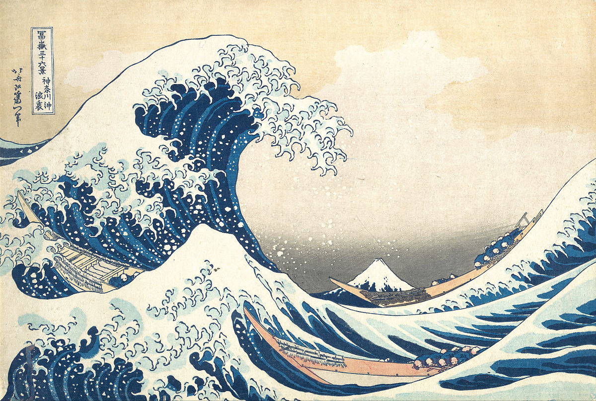
The piece above is one of the most famous uses of informal balance in art. The complexity and value created by the large wave is offset by the gradient of the sky acting as negative space. Informal balance can also be seen in landscape and portrait photography, some logo design and modern interior design, where symmetrical balance is more or less obsolete.
Because informal balance varies so much, and requires trial and error when placing objects, it’s extremely difficult to provide a tutorial in Illustrator. I can, however provide some tips:

1. Start out with simple shapes. Take 3-5 squares, circles, or other polygons of varying sizes and colors, and arrange them on a canvas to find different layouts that evoke asymmetrical balance.

2. Use white space to your advantage. Often times, informal balance can be established by a lack of elements to compensate for fewer bold ones, such as the tree shape above. The amount of white space in your image can dictate the emotions you want to convey such as expansiveness or claustrophobia.

3 Study images to find real life examples. It’s more likely to find asymmetrical objects in normal life than otherwise. Looking at well-composed images and real life examples can be very helpful for training your brain to build its own well-balanced asymmetrical compositions.
Radial Balance

Radial balance occurs when elements are balanced around a single point, rather than across an axis. One of the most common examples of this are mandalas or a sunburst pattern. Radial balance can happen in less apparent cases as well, such as spirals and astrophotography. In the example above, dots and lines are repeated around the middle point of an image.

In this picture, star trails are seen around a single point, yet the visual weight of the sky and the foreground are different, meaning this picture is both radially and asymmetrically balanced.
Here’s a quick and easy way to create a radially balanced pattern in Adobe Illustrator:
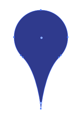
1. Take an object that you want to rotate around a single point. For this exercise, make sure the point of rotation is in the bottom, middle point of the object (In this case, the point of the pin).

2. Apply the Effect -> Distort & Transform -> Transform.

3. In the dialogue, press the bottom middle square in the anchor point selector (9 squares in bottom left), and increase the number of copies. For this shape, I increased it to 5, for a total of 6 iterations. Next, change the angle of rotation to evenly disperse the copies. Since I had 6 iterations, I needed to place them at 60 degrees from each other (360/6 = 60).


4. Alternatively, you can adjust the copies and rotation values, then modify the vertical movement to create some even more interesting-looking patterns. Positive and negative values here can offer some cool results.
In the end, there’s endless possibilities for creating balance in your artwork. Adobe Illustrator makes the process easier, but mastering balance will only come with practice, so try doing some of the exercises above, or experimenting with some of your own techniques!
Sources
https://theblog.adobe.com/what-is-radial-balance/